Our logo distinguishes LucidLink and is a recognizable aspect of our brand and must be used properly. Please, follow these requirements that are designed to optimize the look of our logo.
The LucidLink logo is general and universal for all of our communication channels. We have variations for different purposes to be adaptive for all use cases. Please, don’t change it in any way (shape, color, spacing, etc.). If you are unsure how to use it for your particular situation, contact us at brand@lucidlink.com.
Logo variations
Our default logo is horizontal with a blue-green logo icon and dark wordmark. For best contrast use this logo on a white background or a very light background too.
There are monochromatic versions for paper usage mostly.
Logo elements
The logo contains a logo sign and logo wordmark. Please don’t deviate from the sizing, use of color, and spaces.
The space between the logo sign and the logo wordmark is exactly one x-height. We use the same metric for the exclusion zone.
Exclusion zone
The space between the logo sign and the logo wordmark is exactly one x-height. We use the same metric for the exclusion zone. Keep the space around the logo clear with high contrast.
The LucidLink logo always requires clear space that’s free of text and images around it. We use x-height for x. The minimal clear space is 2x.
Minimal size
The logo needs to stay recognizable. Legibility is a top priority.
Digital: 90px x 16px
Print: 20mm x 3.57mm (0.78in x 0.14in)
Digital: 60px x 52px
Print: 10mm x 8.9mm (0.4in x 0.35in)

Digital: 16px x 13.4px
Print: 4mm x 3.4mm (0.16in x 0.13in)
Placement
The horizontal logo could be used in the four corners of the page. When the logo needs to be positioned in the center, using our vertical logo.
The logo sign could be used in the bottom center.
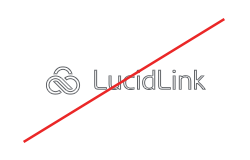
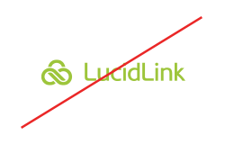
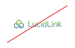
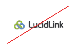
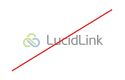
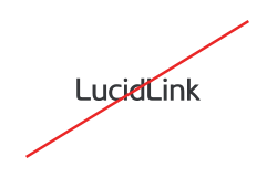
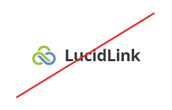
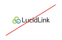
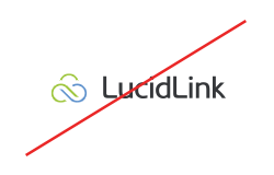
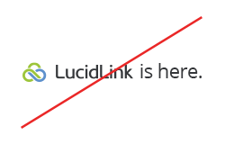
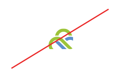
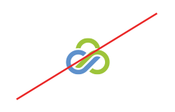
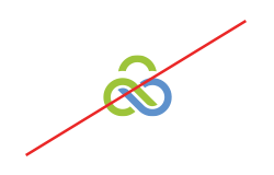
Logo misuse
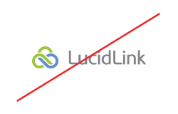
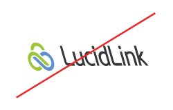
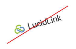
All these rules apply equally for the whole logo and for the logo icon too.
Secondary logo lockups
LucidLink’s logo combined with another logo always has to feel and look equal, or LucidLink’s logo should be dominant.
LucidLink and Partner
LucidLink logo is always first and combined with the partner’s logo through [link] sign.
LucidLink and Customer
For use cases, customer stories, white papers, and others, the customer’s logo is first and related with LucidLink’s logo through LucidLink dots.